The AusBIAS Logo
What’s a society without a logo?
When we first decided we needed a website, the first question was obviously: what should our logo be.
At first I wanted something quickly, and took the obvious route of paying homage (shamelessly plagiarising) the GloBIAS Logo:

In a fit of … what’s the opposite of creatitvity… I created this monstrosity:
My thoughts were:
- change the colours to “Aussie it up a bit”
- highlight the bottom right, where we usually appear on a map of the world.
After all this, I decided it was best to actually ask permission from the GloBIAS organising committee and, while flattered, they were somewhat concerned about protecting their brand now that they’re a legal entity. This was entirely justified so back to the drawing board for me.
Next I looked at the Neubias logo:

Well I liked the look of the network there, so that’s where I started tinkering.
I liked the idea of the napari logo being completely defined in python, so thought I could follow their lead. First - I found a csv file with the latitude and longitude of the major cities in Australia, including their populations. Then wrote a script to put a propotionally population sized dot on each and connect them with lines.
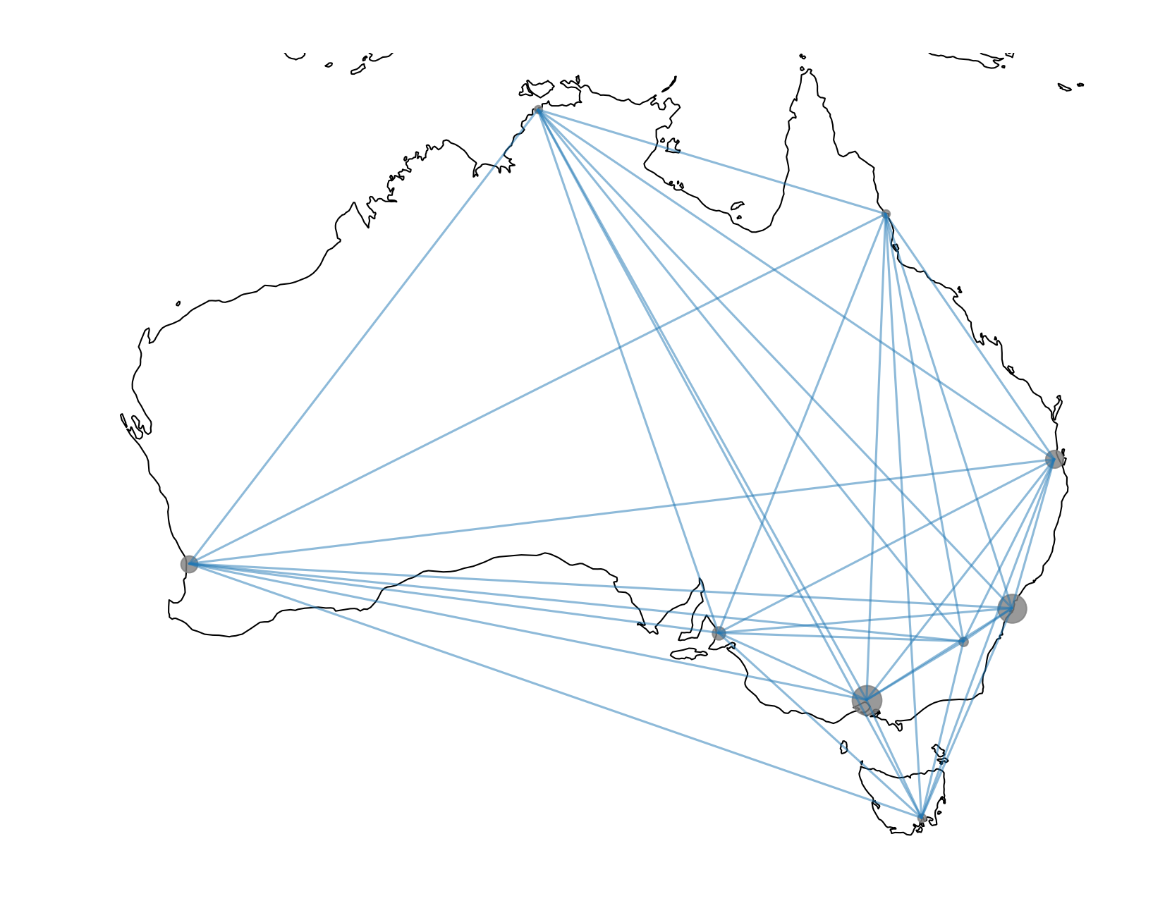
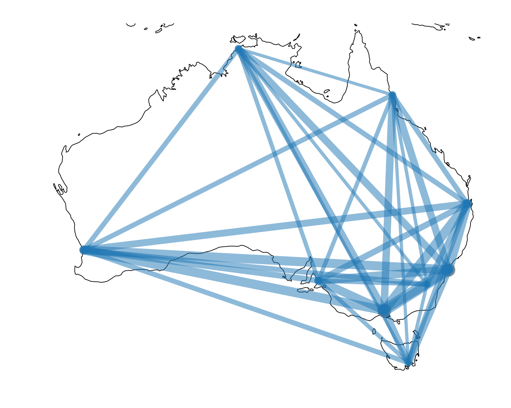
That was cool and all, but as I had scaled the cities to the population, why not do the same with the lines?
I still wasn’t happy so decided to curve the lines, and add a colour map:
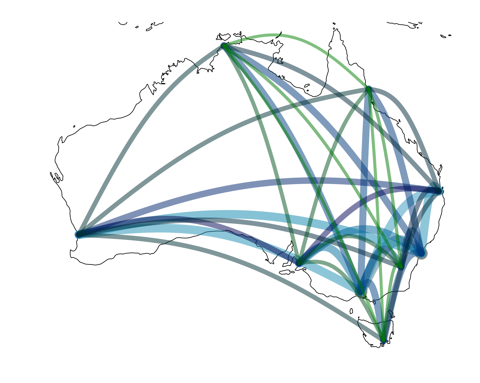
That was it. Thought to make it more abstract I’d remove the coastline, had a design-minded friend (thanks Michael) help chose a font and the rest is (extremely recent) history:
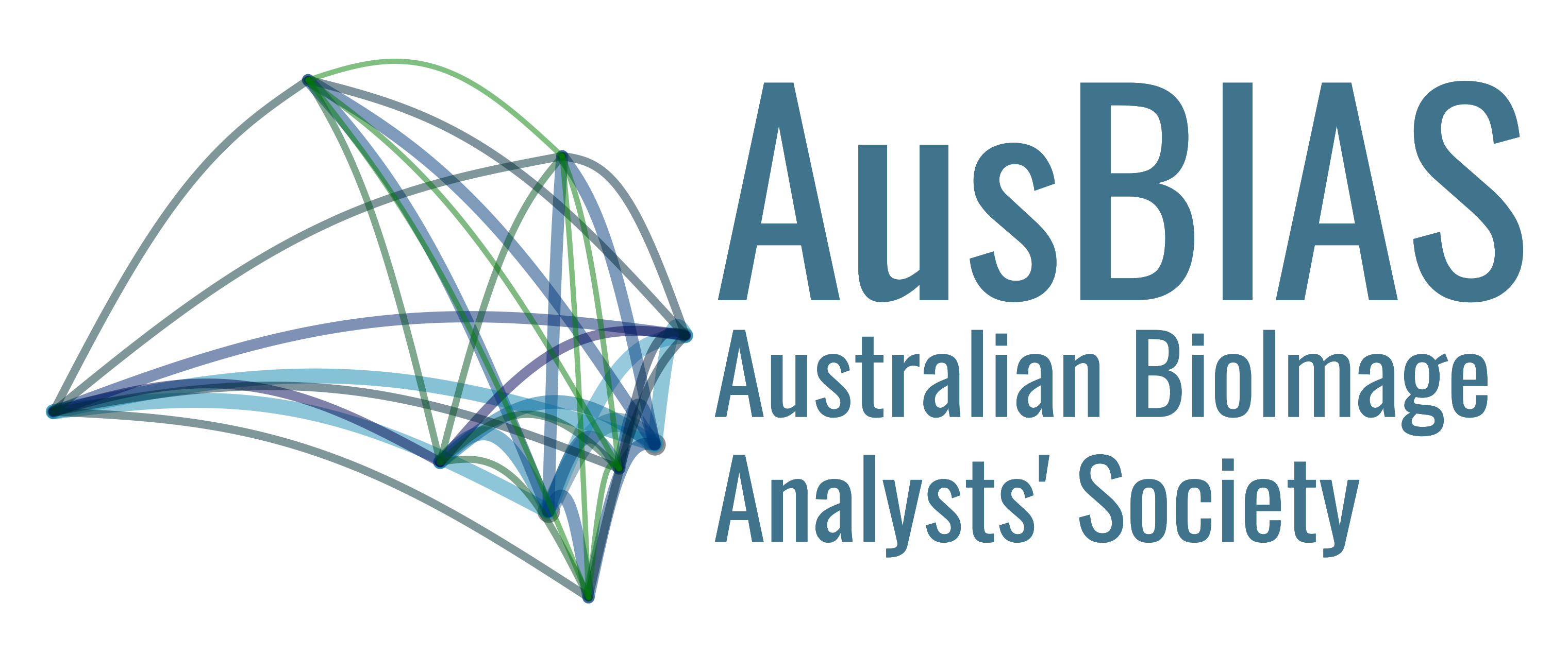
If you want to generate the logo yourself, all the code is in our github!
Fun trivia: the logo initially included Geelong, but not Canberra. It was pointed out that while we do have members who work and reside in Geelong, missing our nation’s capital was perhaps sub-optimal.
